EXPLORERS CLUB
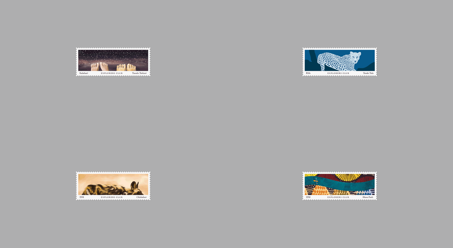
Explorers Club, a unique collection of guesthouses paired with off-the-map expeditions, required a new logo and identity. Our challenge was to create a visual system that represents the eclectic collection of properties, each one unique with its own character and distinct theme.
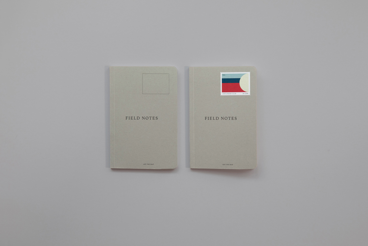
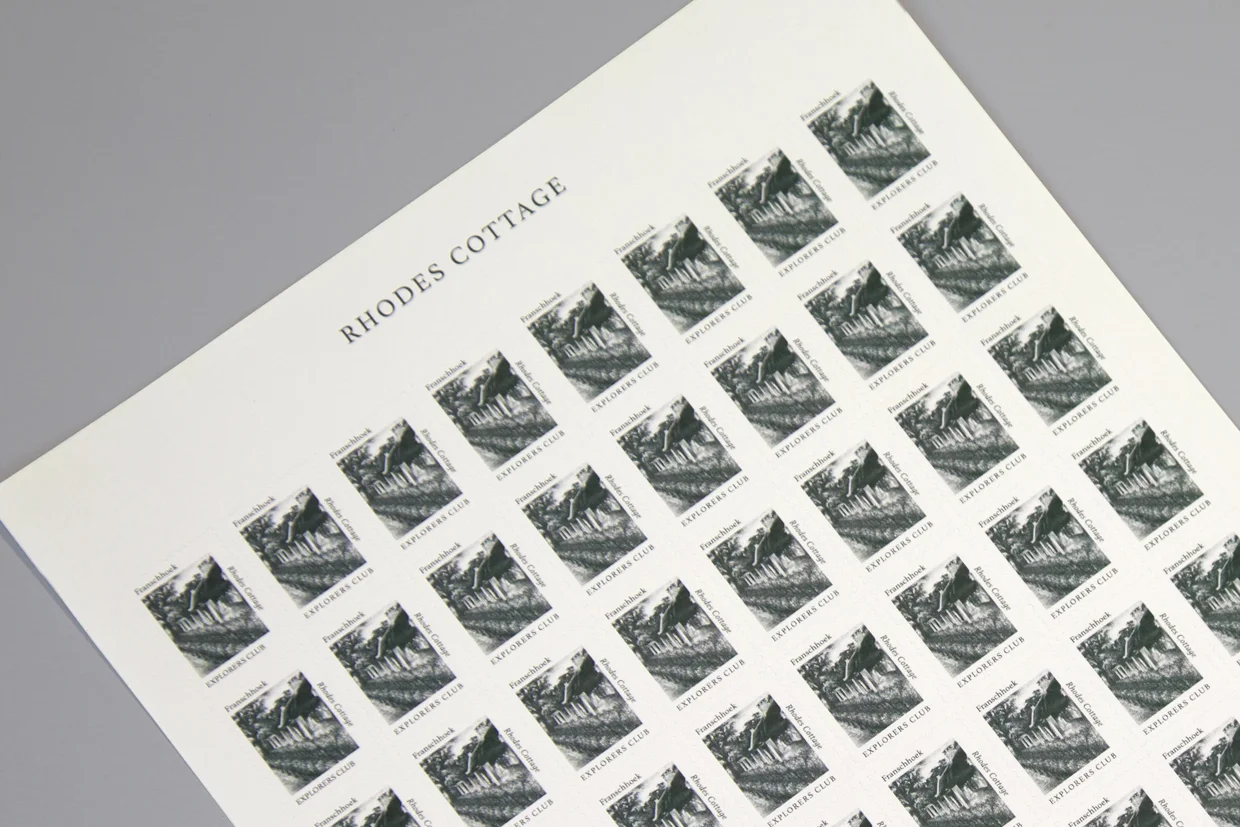
The solution was found in the humble postage stamp – iconic symbols of travel and exploration. With every accommodation being unique, the stamp was the perfect device by which to express the individuality of each property. We established what makes each guesthouse one of a kind and translated these stories into a collection of stamps. The result: an identity that provides a window into the brand, and each of the properties that form part of it. One where visitors don’t just collect stamps, but experiences to write home about.


